I've never taken any courses in accessibility, library science, etc., so I can't comment on what may be best for usability (I'll check out the links provided). I think icons play an important role in user recognition, tho. The new GHS rules rely heavily on the pictograms. McDonalds, Coca-Cola, Target and Walmart spend millions on promoting & protecting their icons. Highway signs, in the USA & abroad, rely on pictograms/icons to keep roadways safe.
I don't think the text book will be translated into any other language.. The students are required to read & understand english for their classes when they apply here. We've had safety instructions translated on a limited basis, but there will be no buy-in from admin for texts.
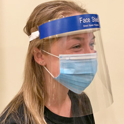
This lab manual will be in print, not web. It is split in 2 columns - like an ANSI standard - the lab steps on the left, the explanations/additional info in the right column. It currently states "use the fume hood for steps 3-6" & a student who is claiming an exposure did not use the fume hood and told me he didn't see that in the right column. The lab coordinator told me that some students have said there's too much text in the right & it interferes with the steps. I thought that having small icons for hood, gloves, googles in addition to the written warnings would make these important safety reminders stand out. The definition/key to these icons would be printed in the front of the manual.
Thanks to everyone who provided google search terms. I had searched google images before sending out my initial request & had only found this: http://www.tru.ca/__shared/assets/fume1509.jpg
Kim Gates Auletta
Laboratory Safety Specialist
Environmental Health & Safety
Stony Brook University
Stony Brook, NY 11794-6200
631-632-3032
FAX: 631-632-9683
EH&S Web site: http://www.stonybrook.edu/ehs/lab/
On Fri, Nov 23, 2012 at 4:22 PM, Karen Salazar
<kls_1**At_Symbol_Here**cox.net> wrote:
Yes, I agree Monona. Graphics are OK if labeled properly. I should have stated that more clearly. Effective labeling of graphics are an important aspect of incorporating usability into a design. It was mentioned in the paper I cited. This blog entry illustrates your point as well : http://www.takadesigns.com/blog/2012/05/07/usability-when-icons-fail/.
I am not a usability expert, but I do know that incorporating usability into your document now will save you many headaches later. Also, if language is an issue, how difficult would it be to create the lab manual in the different languages that are spoken by your user community, Kim?
Karen
I've also read papers and seen personally that people don't read written labels either. So I think a GHS combination of icons and precisely dictated label wording is a good solution. As good as it gets, anyway.
Monona
In a message dated 11/22/2012 11:08:56 AM Eastern Standard Time, kls_1**At_Symbol_Here**COX.NET writes:
Kim,I would caution against icons. When I was a graduate student in library school, I took a class in usability. We discussed the drawbacks of using icons because users interpret them differently. This would probably be a problem you might encounter since you are dealing with a user population that has diverse cultures. If the lab manual is going to be completely digital, then I suggest you consider creating a website for it and using the fundamental principles of usability as you go along (http://www.usability.gov/). Here is a website that was developed with such principles: http://lib..asu.edu/ . We read a paper about its development in class. As you can see, the use of icons is minimal, while text is prominent throughout.
Karen
Salazar
